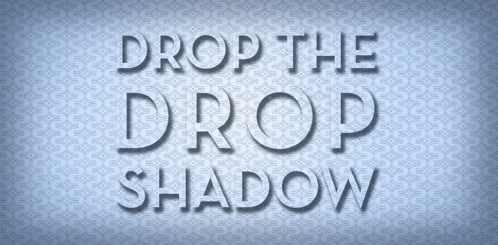
It is with best design practices in mind that we write this post. We’ve recently encountered a rash of logos sporting drop shadows and it left us asking, “What year is it?”
It’s still in fact 2014 and sadly drop shadows haven’t been removed from Adobe applications, but what’s worse is that there are still a contingent of designers using the drop shadow as a legitimate design element (spoiler, it’s not). I’ll caveat this post with the following quote from myself (creative director), “sometimes a drop shadow is a convenient method to separate an element from the background, but it should be subtle and done sparingly… or if, for whatever reason, you’re being ironic with your design… I guess?”
For more specifics, read on.
Clients, if you are inclined to request a drop shadow or if you realize a drop shadow has inadvertently latched onto your logo, please remember:
- Drop shadows provide reproduction issues
- They make a logo look outdated, visually clunky, and unconsidered
- Frankly, they’re ugly (sorry, we have to be honest)
- The only reason your logo should have a shadow is if it’s die cut… and actually casts a shadow
Designers, if you feel yourself getting ready to drop some shadows, please remember:
- You should know better
- Your logo design is not Peter Pan and doesn’t need to find his shadow
- Reference #1 if you’re not clear
Hopefully, this article has communicated my bias regarding drop shadows and equipped you with the reminders you need to avoid one of the greatest visual scourges we’ve ever faced. However, the bigger picture is BEST PRACTICES and elevating your brand out of the shadows (dropped or not) and into the light of good, solid branding.
Stay vigilant, my friends. Brands depend on it.
