When word arrived that we would have the honor of designing the campaign for the 2015 Connecticut Art Director’s Club Awards Show, two things ran through my head: “Yay!” followed quickly by “don’t screw this one up!”
It’s a weird feeling, designing for designers. Usually our work is seen by the general public, who have good taste, but don’t always appreciate or scrutinize the work that same way creatives do.
This year was the 40th anniversary of the CADC show, so naturally we leaned towards an idea that would honor the milestone. The challenge was to celebrate 40 years of design excellence without defaulting to a mundane “happy anniversary” approach.
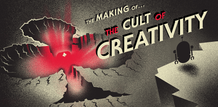
That’s when the quirky, mad scientist gears started turning. Inspired by the idea that the CADC awards show is a time capsule of sorts—an archive of the best designs each year—we headed off down the path towards a conceptual science fiction style narrative.
It went something like this: a mysterious capsule visits Earth (specifically Connecticut), in the mid 1970s. It emits an ethereal force that influences (i.e. brainwashes) CT creatives, who then uncontrollably submit their best creative ideas, year after year. Soon thereafter, a cult forms around the object (the CADC).
Sounds a little nutty, but it was a fun set up for an alternate 40-year history, viewed through the lens of a pulp science fiction design style.
By some miracle, the CADC board approved the concept, and we got down to designing the campaign. They liked the idea of teasing out the narrative via cheeky/mysterious social media posts and emails, leading up to the Call for Entries postcard, which would divulge even more of the concept. From there, more social media would support the awards show messaging.
Eventually, the idea of showcasing different characters (Connecticut creatives) from each of the different eras evolved. After studying a ton of old pulp sci-fi book covers, along with recent illustration and design trends, we came up with a cohesive style.
The first illustration set the tone for the entire project. We went with an airbrush style, a look that really lent itself to the gritty feel we wanted. Then we illustrated our characters, creating attire and accessories that reflected the era they hailed from.
Each character is also seen sporting a pair of period-accurate sunglasses (to help from being blinded by the awesome power of the capsule)—yet another indicator of time and place—that created an opportunity for fun swag at the show.
Once these key visuals were set, we created the Call for Entries, a fun show book, a mockumentary for the show opening, social media posts, and other pieces to support the concept on and offline.
Despite that our audience was our own industry, this really didn’t alter our creative process. We approach any marketing challenge with an intense period of discovery and brainstorming, followed by sketches, which evolve into a key visual. Once that’s set, the vision comes into focus, and the real fun begins – all based on a core concept.
We set out to celebrate this year’s show in style, but with a sense of humor. The reactions have been very positive, which from a crowd of (possibly jaded) designers, is a HUGE compliment. We hope everyone had fun sifting through the mystery of the “Cult of Creativity”, we certainly did.